From Cluttered to Clear: A Dashboard Built for Real-World Users
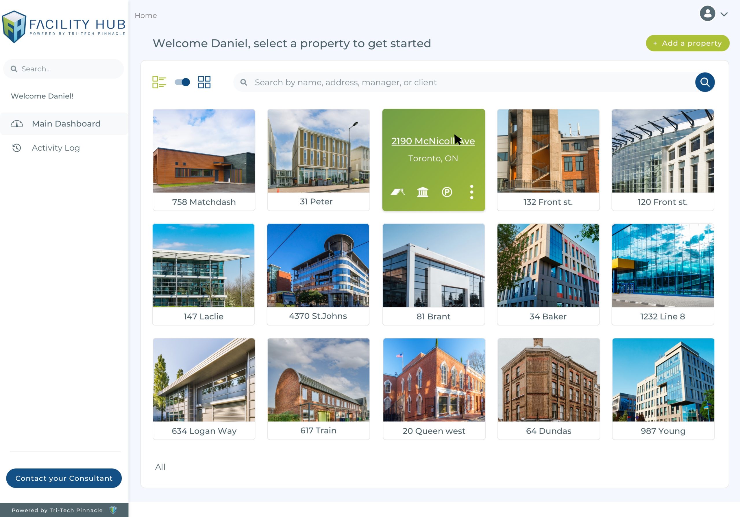
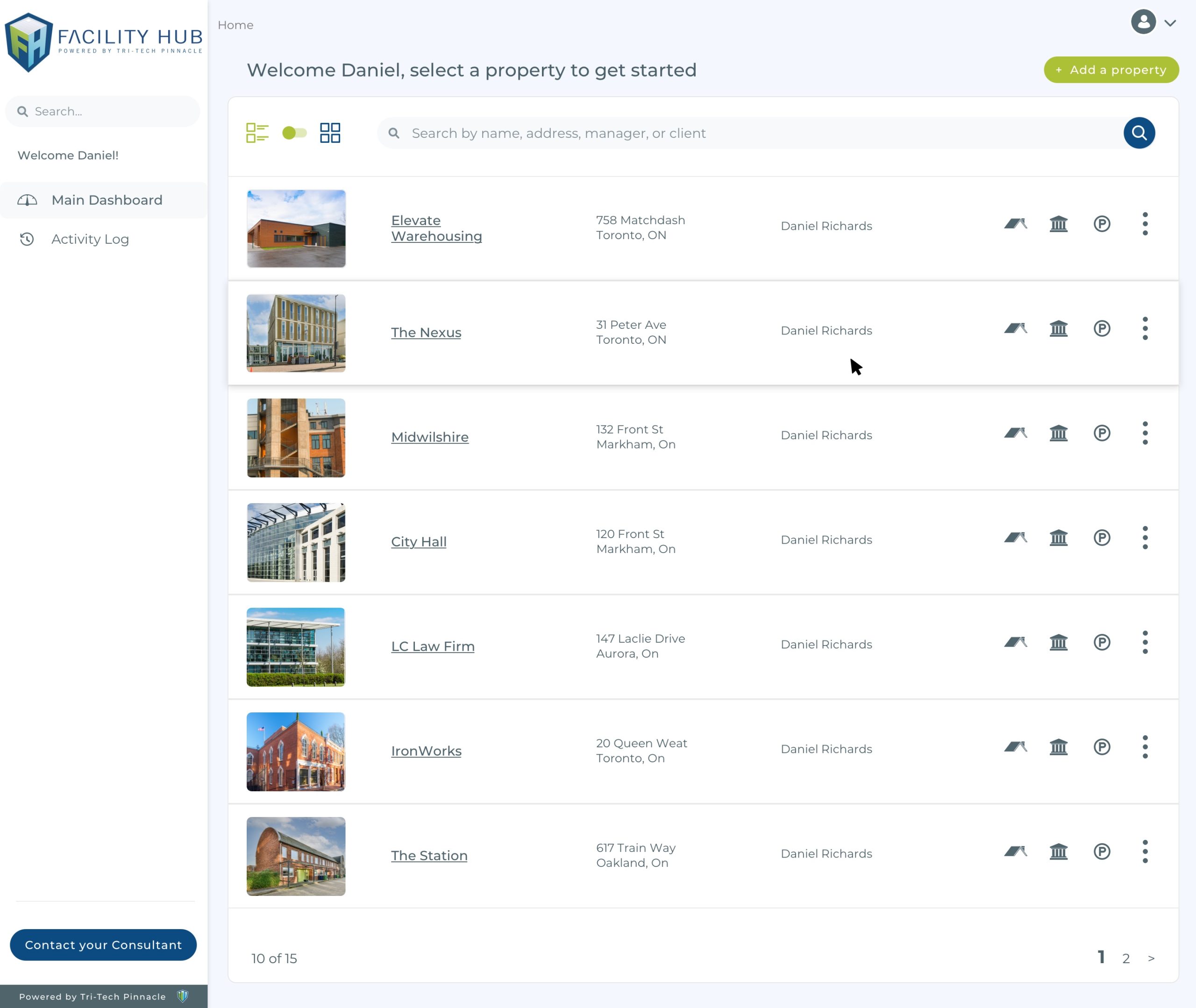
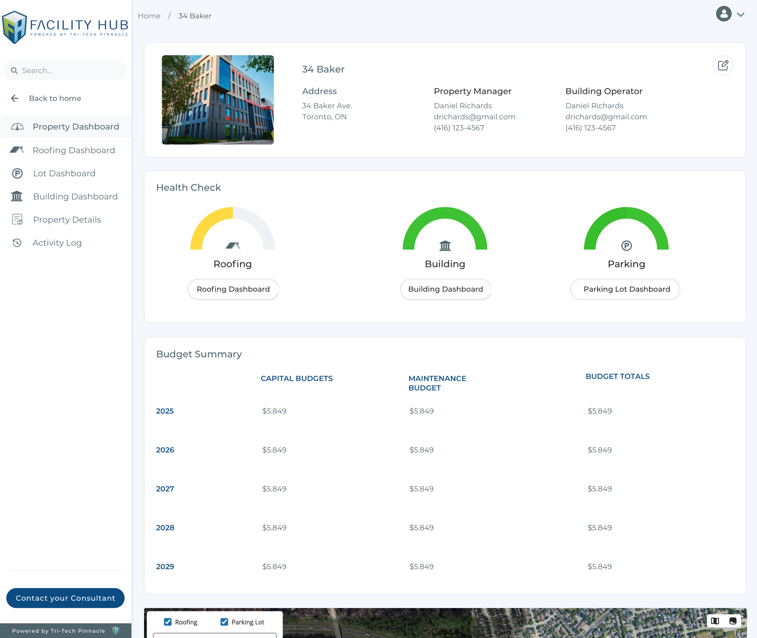
To better serve FacilityHub’s core users—property managers who often aren’t tech-savvy—I led a full redesign of the existing platform to create a smoother, more intuitive experience. The original interface, developed without a designer, lacked visual consistency, accessibility considerations, and clear navigation. My redesign introduced a more user-friendly layout, enhanced branding, and accessibility improvements to support the older user demographic and improve overall usability.
My contributions included:
-
Redesigning the full user interface for simplicity and ease of navigation
-
Applying updated branding with a cohesive colour palette
-
Selecting and implementing a more legible, accessible typeface
-
Adjusting layout spacing and visual hierarchy to meet WCAG accessibility standards
-
Tailoring the experience for an older, non-technical user base
-
Creating a consistent visual system that aligned with FacilityHub’s core functionality and identity
Client
Tri Tech Pinnacle
Date
January, 2025